Seven Common Website Mistakes To Avoid

There are some incredibly common website mistakes you really should try to avoid before launching your website. We all know it: Having a website is crucial for businesses of all sizes, as it provides a platform to showcase your products, services, and brand to a wider audience. With all the work we put into crafting our small business website, we sometimes get so excited about our design work that we overlook common mistakes that can have an immense negative impact on our business.
In this article, we discuss some of the most common website mistakes that businesses need to avoid in order to ensure the success of your online presence.
Mistake 1 - Overwhelming site visitors with navigation, images, text and missing white space
Your website is often the first point of contact between your business and potential customers, and having a poorly designed website can be a major turn-off. A cluttered and unappealing website can make it difficult for visitors to find what they’re looking for, and can also give the impression that your business is unprofessional and unreliable. Make sure your website is visually appealing, user-friendly, and easy to navigate to give visitors a positive first impression.

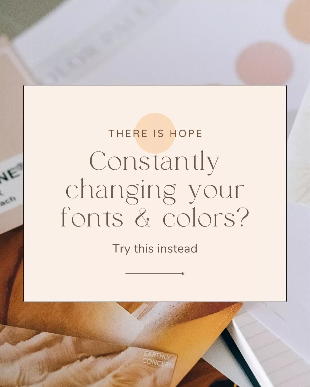
Mistake 2 - Confusing website visitors with multiple call-to-actions in the same pages section
Your website should have a clear and prominent call to action, whether it’s to make a purchase, sign up for a newsletter, or contact your business.
Without a clear call to action, visitors may be unsure of what they are supposed to do next, leading to a high bounce rate and low conversion rate. Make sure your call to action is prominently displayed and easy to find, and consider using multiple calls to action throughout your website to maximize conversions.
Now, sometimes business owners can’t decide if booking a service or signing up for the newsletter is their main goal and think it’s a great idea to simply let the user decide by giving them the option of two call to actions.
Nope. Bad idea.
Why?
Because we skim websites and our brain likes our amount of work to be minimal.
Leaving the decision making to potential clients puts the hard part of decision making on their end and they eventually decide to… click X and leave your website. Fun.
So define your website goals first and then YOU decide based on your goals what to CTA to put up. ;)
Example

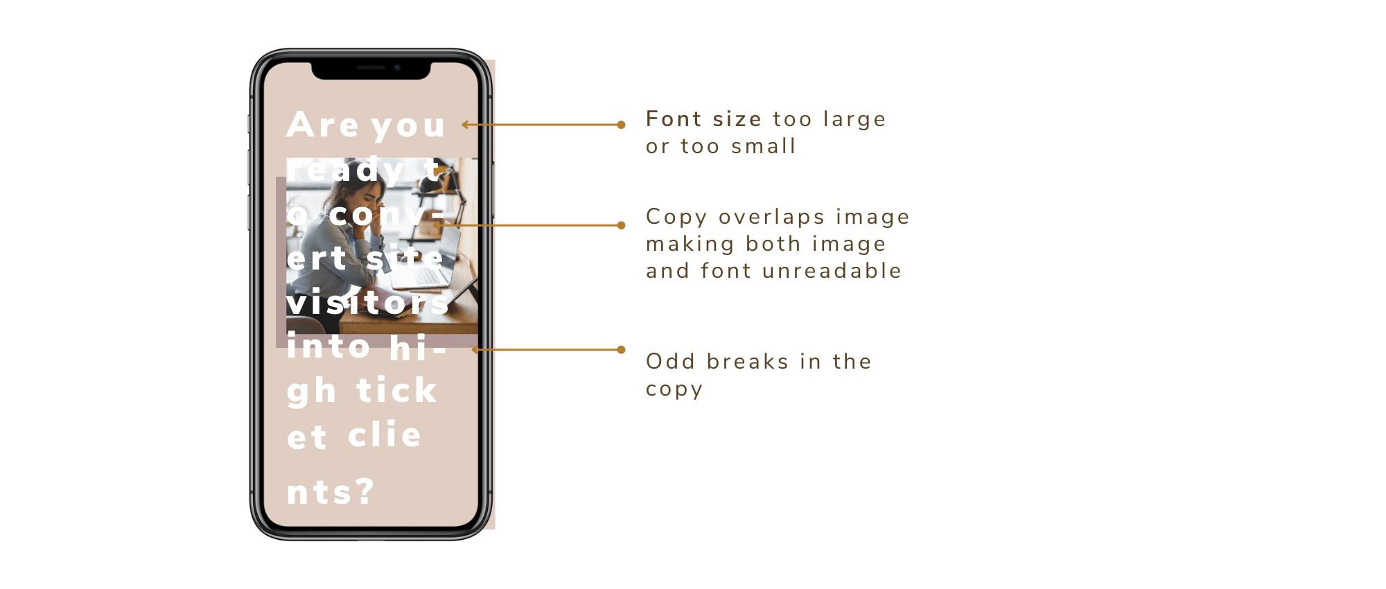
Mistake 3 - Missing mobile optimization
With the increasing use of mobile devices for browsing the web, it’s crucial that your website is optimized for mobile devices.
A website that is not optimized for mobile can lead to a poor user experience, high bounce rates, and low conversion rates. Ensure that your website is mobile-friendly by using responsive design, which allows your website to adjust its layout and content based on the size of the screen it is being viewed on.
Below is an awful example view with bad contrast, non-adjusted font sizes and odd word breaks that simply makes your site visitors run off. So please avoid these.
Example:
Mistake 4 -Missing out on cohesive branding
Honestly, I can’t stretch this enough - please do not start to build your website without first defining your visual branding with fonts, colors, graphcs and imagery that simply look cohesive and beautiful together. Otherwise you might end up putting it all together and it just looks off and turns potential customers away.
Example

👉 💫Like to learn more about branding and how you get the perfect branding for your business? Check out “All you need to know about branding”. 🎨💫
Mistake 5 -Images have different brightness and color themes
Images are part of a great website (duh!) but in order to create a beautiful website that keeps site visitors on your page, it is essential that the images you choose work well with your brand colors and with each other.
Let’s look at the below example:

The overall vibe of the images work quite well, however, the second one with the bright yellow shirt is not a good match, because:
1) It does not match the brand colors (which are green)
2) The image has a higher brightness and even turns the yellow shirt into a “bright color spot”. This is not good, as it draws attention away from our very important website copy and call-to-actions.
Therefore, remember that images are there to support the messaging and transport emotions but should never distract from the website text (copy). When choosing your website images, make sure they have the same vibe, color theme and support the messaging.
Ready to start working on your small business website?
Get this free Website Prep Guide + Checklist
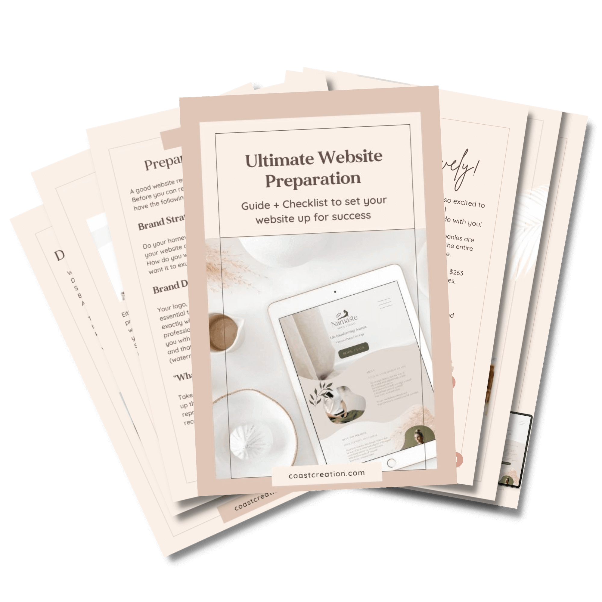
FREE Guide and Checklist
to set your website up for success
Learn what you should consider before you start building your website or hire a website designer
Learn the essentials for a successful and converting website
Mistake 6 -Overloading website visitors with text and endless paragraphs
Ever went on a website with a lot of text and thought “amazing, I’m so touched by this?” No? Me neither.
Why is that?
Two resons why our brain hates text blocks
1.) Text blocks don’t excite us.
Unless you are reading your favorite book, you don’t want to deal with long blocks of text. When you visit websites, you give it a split second to decide if the stay or go. A micro-moment. You want to find out immediately what this is about and what is in for you. (am I right?)
The best shot we as business owners have is to say it to peoples faces right at the start what this is all about.
For example with:
“We build websites” and support it with imagery (gorgeous website mockups) OR (alternatively) catch them with their biggest desires “Imagine your website becomes your most beautiful and powerful money making machine”.
2.) They overwhelm us when unprepared
Imagine you’re opening a book. You see a block of text - all good. It’s expected.
Now imagine you do this on a website: loading… there is your block of text. Click - I just left your website because your block of text totally overwhelmed me as I didn’t expect to see all that and don’t want to use my mental capacity to find out what you and your business is actually about - so I just go somewhere else. Makes sense?
So what can we do instead?
1.) Support website copy with emotionally connecting images
2.) Break up the text into digestible paragraphs (maximal 5 lines of text)
3) Get to the point in telling website visitors what is in it for them
4.) Highlight important parts (and I mean highlight, not making everything bold)
Have a look at this Example

Mistake 7 - Unreadable website copy due to a lack in contrast
Even the best website copy goes down the drain when you simply cannot read it because of funny fonts or a lack of contrast.
Have a look at this website example

As you can see there are many things to consider when building your website. If you are ready to start launching your own professional website for your business, take a look at our services - we love to help!

Meet your web designer for small businesses
Welcome the Blog
I’m a Brand Strategist & Squarespace Designer and support you in building an emotional connection to your ideal clients through your Branding and Website
Are you ready for your therapy website?